The style of the editing in Memento reflects Leonard's condition of short term memory loss. The non linear editing gives the impression of the story being told in two different tenses. The fact the parts of the story are parallel yet are from different aspects, contrasts with the typical way of editing. The introduction of the film is split into colour and black and white scenes, the black and white scenes hint that they are flashbacks yet it isn't confirmed, this is an enigma code; the audience want to know what has happened, and why he shot 'Teddy' in the head. The film opens on an extreme close up of a Polaroid picture of a crime scene; a body and blood all over the wall, it appears to be what you would typically expect a crime scene to look like, this being a cultural shortcut instantly indicates that somebody has been shot. The polaroid has a mans thumb holding the picture. As the credits roll you see the photo being shaken as the image gets lighter, this immediately implies the clip is being played backwards which is a cultural code as you know instantly it is a Polaroid; which you shake to make the image appear. It starts to fade, this links to Leonard having short term memory loss; this is then a symbolic code. The scene continues to run backwards, showing what has happened up to the point of the man being shot. It goes back in slight slow motion, which emphasises how fast it happened when the scene switches to playing forword and the man is shot. The music being played is non-diagetic, it builds tension to the point of the man being shot where the music cuts and you hear the gunshot.
It then goes to an extreme close up of the characters eyes, which illustrates that we are seeing the story through his eyes, this is enforced by him narrating the scene as there is various extreme close-ups, it makes it harder for the audience to focus on the setting. It is then made clear he is in a motel room; the image of him in the motel room again is a cultural code, mainly obvious to the western world, which is the target audience. It is also obvious that it is a flashback as it is in black and white. The mixture of him voicing over the scene, the gray scale filming and the extreme close up indicates something out of the ordinary with this character, that the way he thinks could be in great detail like the clip shows; it makes the audience believe there potentially could be something wrong with him e.g amnesia. This is an enigma code as it creates a story and hooks the audience in, wanting to know more. Linking the two scenes together is the fact that all the clips we've seen are very short which reflects his short term memory, it implied that as the clips are quite intense that he is angry about his short term memory condition.
The narration then continues to Leonard making a payment to the hotel receptionist, it is made clear he 'isn't all there' as he is reminded by the receptionist that they have previously had the conversation. It is noticable that he is also staying in a temporary home, which reflects his amnesia. The character who was shot in the opening sequence then appears at the hotel, which immediatley tells the audience that the film is not showing in chronological order, this is another enigma code; the audience will want to know why they aren't being shown the sequence of events in the correct order. It becomes evident that we are being shown the colour clips in reverse.
The introduction of the film then progresses in the manner of switching from black and white to colour, the impression that it gives is that the colour scenes are being shown in reverse, and the black and white scenes are being shown in chronological order, this gives the audience an an enigma code to ultimatley work out where the two sets of clips will meet. It also gives an insight to Leonard's disability, as we (the audience) are trying to work out his story just as much as he is.
The clip opens with a close up of Tony's face. He is staring straight into the camera as it starts to very slowly zoom out, you can hear church bells which implies it is a Sunday morning - this is a cultural code and could also be interpreted as an enigma code - the audience will ask questions such as why is he awake so early on Sunday morning? As teenagers are portrayed to go out late on Saturday night, a lie-in would be an expected behavior from anyone in their late teens - which the audience can gather Tony is from his face and the appearance of his room, specifically his duvet.
Tony's sexuality could be questioned as you look into this clip. The fact he is lying between the man and woman on his duvet could reflect his sexual preferences; possibly that he could be bi-sexual, or that he could be 'curious' and not have decided on being homosexual or heterosexual. The way the light falls on his face is a symbolic code, the light creates a shadow on his pillow of his face, which could illustrate he is hiding his sexuality, or he is changing into a different person due to his sexuality. The church bells could also show how the church disapprove of homosexual/bi-sexual sexualities, and that it is a constant reminder that he knows in society it is more difficult not to be heterosexual.
Another enigma code is the fact Tony wakes up before the alarm clock could infer he has been worrying about something, possibly his sexuality. His bed also obviously hasn't been slept in which implies he has been out partying the night before. As the alarm goes off this is an action code as he then immediately opens his eyes, inferring he isn't a deep sleeper, and gets out of bed, again contrasting with the idea that most teenagers turn the alarm off and go back to sleep. Also, the reason he has an alarm set early Sunday morning is another enigma code, making the audience wonder why he needs to get up; this drives the narration on.
As the camera zooms out and Tony's room becomes more visible, it is clear he is almost too organised compared to what most stereotypical teenager's bedrooms would look like. His room is decorated in neutral colours, contrasting the naked bodies on his duvet. Linking back to the idea he is unsure on his sexuality, due to him lying between the man and woman could be challenged as the man is lying on his front, revealing less than the woman who is lying on her back; this shows he could be more interested in women as the image reveals more than the man.
The naked bodies on the duvet could imply he is quite confident as normally male teenage bedspreads are chosen by their mother, and are quite plain. It immediately shows his taste and how he is possibly seen as a typical 'lad' by his friends. Another item in his room that indicates his confidence is how he has a supermarket storage item as a bedside table. Thinking about it logically the fact he would have to get the trolley into his house, up the stairs and into his room without his parents noticing would require a lot of confidence, or maybe suggest his parent's aren't bothered about what he does in his spare time.
If you were to look at this clip from a passive point of view it wouldn't be
obvious there are hints questioning his sexuality, yet the editor has clearly added these clues to give the impression that he could have different sexual preferences than first meets the eye.
Diagetic sound - Natural sounds that are sourced within the scene e.g people having a conversation, radio playing in the background, doors open/shutting, bullet shots in a war programme. In this clip all the sounds are diagetic; nothing has been added to create a specific atmosphere.
Non diagetic sound - Sound added to create atmosphere or tension e.g Theme tunes.
A potential problem with non diagetic sound is that it may make it less realistic, yet the potential benefit is it can make it more dramatic. The man overspeaking and the dramatic 'Jaws' theme tune added tension to this advert.
Sound bridge - Sound which carries on over two scenes, literally creating a bridge between events.
Indicental music - Short sequence of sound to create an emotion / feeling. e.g sad slow music to emphasise a character being upset.
Asychronous sounds -A 'natural ' sound out of place and without a source.
Contrapunctual - Sound which creates an opposite emotion to the one on screen. e.g a happy scene with sad/slow music playing.
How does Calvin Klein represent females in the above advert? are they objectified or sexually empowered?
The idea of the 'Male Gaze' is obvious from this photo, or any underwear advert. The way Eva Mendes has been styled is obviously to be aesthetically pleasing to a man, this raises general questions such as how men look at women, how women look at other women and how women look at themselves. Relating back to Laura Mulvey's 'male gaze' this advert could be interpreted in different ways. The way men look at women; Obviously I am going on stereotypes with this point as I am not a man, but when a man looks at this advert it would mainly be for Eva Mendes' body and the fact she's in sexy underwear. She is also oiled up and has damp hair, which links back to her looking as if shes just got out the shower, which is associated with sexiness. As you look at her stance she looks powerful, so some men may also find that attractive and feel if their wife/ girlfriend/ lover/ partner wears the underwear, they could also look like this. The power is shown in the way she is standing with hear head turned back, her hands on her hips (her fingers pointing to the briefs), her legs apart is a powerful almost masculine stance. Her eyes being shut goes back to Laura Mulveys idea of the types of women, that Eva is creating a mysterious look because she's not making eye contact, the fact she's not wearing a wedding ring show's she's available, so the 'too good for you' vibe comes off of her. The second point of how women look at themselves could be a bit intimidating. As about 99% of women do not have a body like that so it could put them off, or if a slim woman looks at it, she could feel like she wants to wear it to boost her confident or look like Eva Mendes. Other women wouldn't look down on her as the underwear isn't slutty, more 'tastefully sexy'. It could also make women judge other women, and possibly Eva for posing like this. From a feminists point of view they could also think ' good on you ' for looking powerful and dominating, like she is marking a teritory. I reckon that using this advert as an example men could definatley objectify women as something good to look at, but from a womens point of view they could feel sexually enpowered and in control.
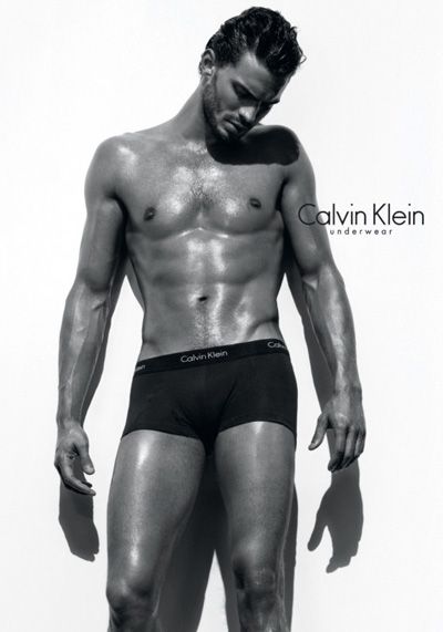
Compared to the Calvin Klein advert with Eva Mendes, this one of Jamie Dornan contrast when you look into the underlying signals. In my opinion this advert is aimed at both men and women. The stubble on his face and the hair on his chest shows he's not over-groomed, which would make men feel less intimidated by him, despite having a very toned body it doesn't look as extreme as the muscles body builders have, as he doesn't have a six-pack, or it has been photoshopped out; it isn't supposed to overpower or challenge men, it is a realistic man. Jamie's body language is vunerable, with the head facing down and his arms hanging by his side doesn't portray power like Eva Mendes' advert did. This relates to women liking vunerable men, which would draw their eye to the advert, along with his amazing body. I asked my friend Megan what she thought when she looked at this advert; ' It makes me want to buy the boxers for my boyfriend, as it gives the impression that he'd look as hench as the model'.
When it comes to the boxers there is no emphasis on them, as they are plain and there's no body language pointing towards them or enphasising them. The 'Calvin Klein underwear' slogan is near the upper half of the body, which doesn't draw attention to the boxers more to the mans body. The result could be switched as men could feel sexually enpowered for wearing these boxers, and women could look at this man purely as some eye candy.
Stereotypes shape the publics opinion. They are narrative shortcuts which orientate the audiences expectations. Some people argue that stereeotypes are fixed and unchanging. This links to the hypodermic theory that cinema injects people with stereotypes. Leon Festinger beleives we resist changing our opinions unless faced with overwhelming evidence against what we beleive. Cognitive disonance is when our brain encounters new ideas and rejects them because they don't match our expectations. This is subjective to opinion, it also works in the sense that overwhelming evidence can change your opinion on something as it seems more plausable.
We then watched everybody elses prezi presentation on seven stereotypes re-presentated in the media.; all of these views are not mine they are ones that appear to be portrayed in the media. Age
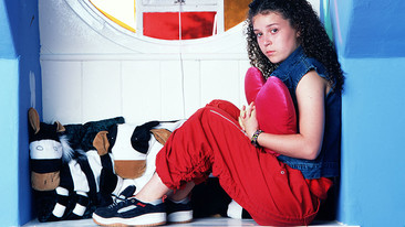
Children; Children in the media are played as the same age of the target audience. e.g Tracey Beaker/ kids at the dumping ground are all the ages of the target audience. The media portray children to be good people so that the children watching aspire to be like them. 12-14 year olds; nearly always play cool characters who lead action packed, interesting lives, they always play the good guys e.g M-I-High, again it gives something for the target audience to look up to.
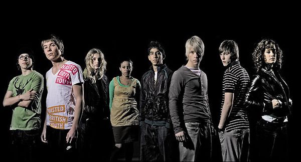
15-18 year olds; Never normally played as 'normal' teenagers. You have one end of the spectrum, such as skins where all the teenagers are seen as druggies, dropouts, violent people who lead exciting lives going out partying getting off their face which is, lets face it, hardly like the lives of teenagers i know. Then the other end of the scale would be The Inbetweeners, which shows social rejects and their struggle on getting girls and getting through the hurdles of teenage life. That is more realistic but obviously not a match to everybodies life. Characters such as Vicky Pollard are used to discourage mid teenagers becoming like that. People look down on her and take the piss out of her which makes her a bad role model and would make people avoid being like her. Older people (30+) 20-30; Hollyoaks represents the idea that when you're younger you dress older and when you're older you dress to look younger. It reflects that the 20's is the prime time of your life and everyone is successful.
Eastenders shows that you get more sophisticated as you enter your 30's, e.g drinking wine instead of alcopops and that women dress more their age, more glamorous. It shows men being more successful, dressed in suits. Elderly people are re-presentated as being old, mardy, weak, not with it, complaining or contrastingly as a happy chappy 'war hero'.
Ability & Disability
There are many typed of disabilites, but the one the media foucuses on is people bound to a wheelchair. Disabled people are typically seen to be wearing comfy clothes, as they are viewed to be housebound and don't actually need to get out of their wheelchair. Normally characters in wheelchairs are vunerable, don't make much effort and aren't energetic. This depicts disabled people. Andy and Lou from Little Britain make full use of the stereotypical disabled person. The settings of Andy's house is untidy and dirty, implies that because he's in a wheelchair he can't do day to day chores.
The camera nagle tends to look down or at a disabled person, never looks up to them. It is common that the carer is in the image with the disabled person, rather than focusing on the individual person. Another thing that doesn't focus on the individual person is when you hear stories of disabled people doing well, e.g if someone who had lost their legs and had fake ones put on and ran a marathon, would get a lot more praise than someone who had both of their own legs. This re-inforces that non-disabled people patronize disabled people. The personality traits of disabled people in the media are either that they are evil, or stupid. There's rarely a normal character in a wheelchair.
Gender
The toilet sign is something we all recognise, it gives the cultural signal of women wearing skirts and dresses, and men having broad shoulderrs and having thicker legs/arms than women. Nobody challenges this or gets 'mixed up' on what toilet to go into as this is what we accept a sign for female and male toilets. Stereotypically males are seen to be wearing trousers, short hair, strong, earn more money, working, bigger. Women are seen to have long hair, not physically as strong as men, less responsibility and to be a typical housewife. The picture shows a 1950's woman getting pies out of the oven. This image shows a typical 'housewife' getting pies out of the oven, the child in the image also represents how women were supposed to stay at home, raise children and put dinner on the table for when the
husband ges home. Jokes people make nowadays about women being in the kitchen relates back to this. In contemporary soaps males are seen as the supporters, 'stoic', never the other way round. The women are seen as 'wearing their heart on their sleeve' and don't tend to control their emotions. The physical fighting in soaps , 9/10 times is done by men, if it is done by women its more of a bitch fight. It perpetuates stereotypical views, if you type fight into google, no images of women come up.
Regional Identity
Northeners- People are friendly yet reject anyone from the south. They are portrayed to moan a lot and consume a lot of alcohol. On average they live a 'lower class' life, and that more crime happens compared to the south. In this clip Frankie Boyle portrays scottish people by picking and exaggerating certain stereotypes.
Southeners- They seem to live a more upbeat lifestyle, mainly based around cities. They have a more 'Newsreader' Accent, which is easier to understand but is labelled 'posh'. They are more forward about subjects.
Countryside - From places such as the west country or Norfolk, are harder to understand and maybe seen as not ' with the times ' . Also seen as farmers, they wear more relaxed clothes, have more rural jobs e.g farmers and are seen to have a more physical working lifestyle. This clip from hot fuzz exaggerates the west country accent.
Ethnicity Hoodies are portrayed to be the sort of clothes that make people unnaproachable, and black people are normally seen to be wearing them. This enforces that black teenage/early 20's boys are thugs.·That they are lazy, don't want to work or help the community. This stereotype is challenged in Hollyoaks by a young black male (Calvin) is a police officer and therefore is helping the community.
The full on traditional indian wedding is seen as a stereotype. That all indians dress in their shari all the time. Bend it like Beckham shows a stereotypical indian family, and their reaction to Jess wanting to play football -something indian girls dont do. This picture shows Jess' football team getting her dressed in her shari, exxagerating the cultural differences between a common western game and indian expectations.
It is also seen in British television that a majority of the actors are white, emphasising people of a different ethnicity are a minority and different.
Sexuality
Gay Male's wear tightly fitted clothing, are more into fashion and style than hetrosexual men, they like to spend their time out clubbing with girl friends, and often take part in gay parades.
Mr G in summer heights high is how you would expect a gay middle aged man to behave. He is into performing arts and is quite affeminate the way he speaks and acts.
He's quite bitchy aswell which is a trait that is normally associated with girls. He also has a 'handbag' dog called celine, handbag dogs are also seen to be something girls would have.
Plots tend to include coming out, how they cope and the abuse that suffers. This is focussing on the negative points of being homosexual. Lesbians are also portrayed in the media as having short hair, being butch, into contact sports such as rugby, deeper voices and act manly.
Status&Class
Mine and Jordan's Prezi presentation was on Status and Class;
We found that there are three main 'classes'; upper class, which is royalty, lords, dukes, and millionaires. Middle class; which is everyday people. Most of us fit into that category. Lower class; chavs, homeless people.
We associate the 'upper class' people to be rich, play sports such as polo and cricket, go fox hunting, live in mansions, have lots of jewells/diamonds, wear tweed, have afternoon tea, have a butler and drive a bentley. Usually people with higher class have the upper status in the media, and tend to have control of the situation.
Middle class is what we would consider 'normal' people, living in a semi-detached house, do normal things such as go to festivals, shopping with friends, have jobs such as teachers or bankers and have the typical 2.4 children. Outnumbered is a good representation of a middle class family. The setting is in a house and the situations that happen are not far from real life. The song ' The day I died' by Just Jack describes (up until the death) a typical day of a middle classed person ' drag myself from my bed, around twenty past six, get my kids up make breakfast 1 egg 2 toast 3 weetabix ' seems like a realistic routine that middle class people do.
Working class is seen as Chavs, wearing baseball caps, living in council houses. Bianca from Eastenders talks like you would expect someone from a lower class to, with a strong cockney accent. This indicates she isn't well educated and is a bit gobby. They are also related to not having much money.
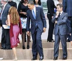
The Male gaze is the idea that all aspects of media are from the perspective from a hetrosexual man. This picture of Barack Obama gives a good representation of the male gaze. It re-inforces that 'men look', and that men deliberatley re-presentate the media in from that perspective, the concept is of the male gaze is one that deals with how an audience views the people presented.
The film audience have to 'view' characters from the perspective of a hetrosexual male.
The features of the male gaze;
The camera lingers on the curves of the female body, and events which occur to women are presented largely in the context of a mans reactions to these events.
It almost relegates women to the status of objects or possessions. The female viewer must view from a males point of view.
For feminists, it can be thought of in 3 ways;
- How men look at women
- How women look at themselves
- How women look at other women.
From the concept of the male gaze it demonstrates that the way women are portrayed, men look at women more for their body or what they could potentially offer in ultimatley a sexual way.
It makes women look at themselves and compare them to photoshopped models, and maybe have lower self esteem as they aspire to be like the women in underwear adverts or catwalk models.
Naturally, women compare or judge other women, but look at them in a completely different way to 'stereotypical' man. If i look at another girl e.g in the street I am usually looking at how they style their hair or what they are wearing and compare them to what I am wearing.
The way women are portrayed ( men checking them out) can be used to their advantage, such as flicking their hair or sitting in a certain way to get male attention.
We watched the music video of ' She's so lovely - Scouting for Girls '
Mr Smith then asked us questions,
What colour was the boy and girls top?
What number lane were they at?
What colour belt were they both wearing?
What shoes were they both wearing?
What colour eyes did they have?
Predictibally the girls got way more right than the boys, as the girl in this video would be 'eye candy' and distract them from noticing other things. This is a typical example of the male gaze.
Marjorie Ferguson (1980)'s
The chocolate box;
half lips/ full smile
lips together/slightly parted
teeth barely visable
full/three quaters of face to the camera.
Looks like a typical girl next door, quite sweet, blandly pleasing, uninformity of beauty and devoid of uniqueness. Gwyneth Paltrow looks sweet and innocent on this cover of vogue, despite having heavy eye make up she looks like 'the girl next door', she also is looking above the camera which could be interpereted as being flirty, as when girls flutter their eyelids they look up.
Invitational
Emphasis on the eyes
Mouth shut with a hint of smile
Head to one side or looking back to the camera
Sugestive of mischeif or mystery, hint of contact rather than sexual promise. Keira Knightley has her arm on her head and her mouth slightly open, making eye contact with the camera which shows she has confidence, but her facial expression isn't giving too much away.
Super Smiler
Full face
Wide open, toothy smile
Head thrusts forword or chin thrown back
Hair often wind blown or big
Agressive, look at me smile, unaproachable and maybe a bit attention seeking and over-confident. Sienna miller has backcombed messy hair wich shows confidence, her outfit is quite outgoing which matches her expression, which is layed back but shows she's confident and happy.
Romantic or Sexual
Includes male/female 'two somes'
Dreamy
Heavy Lidded
Overtly sunsual/sexual
Possibly or definatley available, gives off the signal that she is easier to get than other girls and maybe not up for anything serious. The model in this is making eye contact with the camera, with one hand on her hip and standing in a 'powerful' way with her legs open, could indicate a sexual message to males.
Trevor Millum (1990's)
Seductive
Similar to cool/level
Eyes less wide
Expression is less reserved but still self confident
Milder
Cheryl Cole on this cover gives the impression that she's independant and powerful and knows exactly how to get a man to look at her.
Carefree
Nymph like
Active
Healthy
Vibrant
Outdoor girl
Often smiling/grinning
The model on this cover looks healthy as she has good complexion, teeth and healthy natural hair. She looks the type as if you met her you could imagine to live a busy lifestyle, it looks to me as if you could imagine her playing tennis and being a bit ditzy.
Practical
Concentrating
Engaged in business in hand
Mouth closed
Eyes object directed
Sometimes a slight frown
Hair often tied back or in short smile
This woman looks as if shes stressed by work, she may be unnaproachable and quite driven and indipendant.
Comic
Deliberatley ridiculous
Exaggerated
Acting the fool
Pulling faces
Agyness Deyn is a classic example of Milliums view of a ' comic ' she pulls a variety of different facial expressions and often seems like shes having a laugh and not being entirely serious like most stereotypical supermodels.
Catalogue
A neutral look as of a dummy, artificial, mannequin, wax like
Features may be in any position, but most likely to be with eyes open wide and a smile
Looks remain vacant and empty with peronality removed.
Uma Thurman isn't really pulling a specific face, it looks like it is in a neutral position. The picture doesn't really infer anything so no message is given.
The task we were given was to ask ten people in our class 15 questions on their film viewing habits.
Me and Becca worked together to come up with 15 questions and ask them to members of our class, here are our questions and answers;
Audience Viewing habits questionaire
After looking at this questionnaire I came to the conclusion that most of the people i asked ( bar one person) don't chose to watch a film based on it being made by an American or British film company. It is inevitable that some, clearly not many, people chose to watch a film whether it is American or British, that is down to taste and opinion. It seems that more people watch a film on its content rather than whether it is American or British. It obviously it is impossible to generalise that statement as I only questioned 11 people, not the whole population. It is clear from this questionaire that we watch more American than British films, possibly because there are less British films to watch and maybe people just like the style of American films better despite saying it doesn't affect which films they view. I also thought it was quite contrasting that people didn't seem too bothered about whether a film was in 3D or not, considering the amount of money that goes into 3D cinema, and that about half of the people we questioned didn't like the idea of a 3D tv.
In this lesson ( 5.10.10 ) we learnt that Roland Barthes was a semiologist, he looked at texts and basically that was his job.
There are two types of narrative, open and closed.
Open narrative is when the tv/film could be interpreted in any way, there isn't a set ending, e.g soaps and films that have no specific ending.
Closed narrative is where there is no other way the audience could interperet an ending , it has to be very specifically scripted so the audience get what the director is putting across. Detective drama's and childrens programmes are usually closed narrative. Childrens shows are closed narrative because a child doesn't normally have interest in a running series, the programme is just there for watching at that specific moment in time.
There are five narrative codes;
#1 Action code
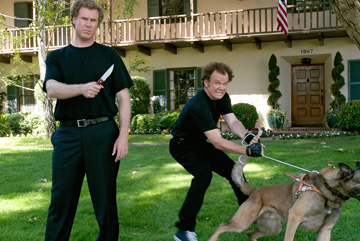
applies to any action that implies further narrative. e.g a gunslinger draws his gun on an opponent and we wonder what the result will be. This picture of Will Ferrell and John Reiley in Stepbrothers has two obvious action codes in it, the fact 'Brennan' is holding a knife and looking pretty angry, and that Dale looks like he is about to let go of the dog. Basically the signals imply anything action related could happen.
#2 Enigma Code
Refers to any element in a story that isn't explained and therefore exists as an enigma for the audience, raising questions that demand expectations. This draws the audience. The Harry Potter series has many layers to its 'enigma code', the question of whether he kills voldemort is obvious right from the first book/film. It makes the audience want to carry on watching as they don't know the answer to the question and want to find out in order to enjoy the film.
#3 Semantic code
Any element in a text that suggests a particular or an additional meaning by the way of connotation. So basically something that has multiple meanings and it gets it across to you.
#4 Cultural Code
Any element in a narrative that refers 'to a science or a body of knowledge'. Basically, the cultural codes tend to point to our shared knowledge about the way the world works. Santa Claus is a good example of this, in the western world an old large man with a white beard, red clothes and a red hat with white fur around it is automatically associated with santa. Whereas in China or somewhere in the far east, it would typically be an old man wearing red.
#5 Symbolic Code
Its very difficult to understand and explain, but, it is a symbol that represents something that the viewer will recognize. It could also reflect a type of non verbal communication that we use in everyday life. Symbolic codes are mainly linked to different cultures.
, rushmoreIt is made pretty obvious from the start of the montage that Max does quite a few more extra-curricular activities but when you scratch the surface and actually think about it he does way more clubs than any 'stereotypical' teenager would do. The media portray a specific image of teenagers. They make out that a vast majority of teenagers drink, smoke, do drugs, hang around on parks in the evenings, terrorise old people, commit crime such as shoplifting, are antisocial to others in the community, have unprotected/underaged sex, do graffiti and wear hoodies and joggers. The song 'Teenagers' By My Chemical Romance reflects how some adults would look at teenagers. TV shows such as The Inbetweeners and Skins reflect different ends of the teenage stereotype;
The montage opens with max opening a red book with bee's on the front of it, this could relate to him being a busy bee, or the bee's knee's, or the fact one of his clubs is a bee-keeping club and maybe that's his favorite club. The clip then shows Max turning over a page to show him being an editor. Its as if the way the book is presented its how Max wants us to see him, from his point of view, as he's controling turning the page and that could reflect to how he feels in reality, that he has control over how we see him and how he does his clubs but that he really doesn't have the control/power he desires. The clips of him doing the out of school clubs are quite short per club, but the image that is portrayed is enough to give the audience the idea of his role in the clubs. It could also show that because the pace of the montage is quite fast that his life is fast paced too, with not much spare time.
You could denote from the 'French Club' that Max doesn't have any friends his own age, and likes the power. This can also be shown through him wearing a red beret and everyone else wearing blue, red is a more powerful colour than blue and it singles him out as clearly being more important than the others. He is also wearing his blazer, when none of the others are. It could almost show the dynamics that a teacher has with a student ( lads wearing shirts, him wearing shirt,tie,blazer) and that he feels in charge of this club as though he were teaching a class. The sash (in the colours of the French flag) also singles him out and represents power, like the Queen is sometimes seen wearing a sash. He clearly feels a high sense of self- importance. The shot is from a high angle in order to get all the people in, the lads in this shot are static, and grinning as if this was a photo being taken. Which could reflect his life how he wants us to see it through this montage is a bit posed, as its bigging him up in every possible way and there could be lots of things that we dont have a clue about because he hasn't shown us. It also reflects on Max's quirky side that he is interested in culture and in his 'pretend world' of clubs he'd like to be the french president.
They also put pressure on teenagers as year after year they say that 'Gcse's are getting easier so teenagers are getting bad results' which isn't true, as GCSE's aren't easy. I think the image put across by the media is a very negative. I think that it is obvious from the beginning of the montage that Max doesn't fit into that stereotype.
Looking at the type of clubs Max goes to he clearly has a lot of time on his hands. He does about fifteen out of school clubs, which isn't very realistic but it gets the point across that the director wants to make; That he doesn't really have a life other than these clubs. The more times we watched this montage, the bigger the gap was between Max and a stereotypical teenager as its not just the fact he does a lot of out of school, its the type of clubs he does like being the 2nd Chorale Choirmaster and the Bombardment Society Founder. That reinforces my view on him as being a bit of an outcast, he may just go to these clubs because he has no friends and he feels like he is in control, espcially as the kids that go to his clubs are all younger than him so they obviously look up to him and respect him because of his age.
If you look at it from another perspective, e.g his teachers/parents it shows that he is clearly enthusiastic about his education and is trying his best to do well in school. It shows that he is independant and has a lot of interests and in his eyes he's probably having a great time because he gets to do all of these out of school activities, and making friends that would be outside of his lessons (because of the age). Max clearly is unhappy with his social status as in the 'Model United Nations - Russia' club he is the Russian leader, which links back to political context as America and Russia were the two biggest econimies in the world before China overtook Russia. The reason he chose to be the Russian leader as maybe he feels like he isn't accepted and appreciated in America so he'd rather be leader of the othher largest economy to show them he is worthy and they have missed out.
Therefore in my opinion, I don't think Max is a stereotypical teenager.
This lesson Mr Smith explained to us what Re-Presentation was, then asked us to write down ur own definition of Re-Presentation, mine wasn't very easy to understand because I knew what I meant in my head, but found it hard to write it out. My definition of Re-Presentation was; 'Re-Presentation is the copy of something that is perceived to be real, but actually is acopy of something that is made out to be real by the copies. Basically, copies of copies, in a big circle.' The actual definition we were given was; Re-presentation; The way the media present 'something' as though it were real, it is not real, merely a copy of something. We were also given some other definitions... Signs; Something which communicates a piece of information e.g a road sign giving directions to where you are going Signifiers; Multiple 'ideas' or ' feelings' behind a sign. All signs/signifiers belong to cultures, so people in other cultures will relate to different signs e.g wearing a wedding ring on your 'ring' finger in this country may be worn on another finger in a different country, but will still give off the same sign of ' i'm married'
Mr Smith asked us to draw a picture of a house with the sun shining , a tree in the garden and a number from one to ten. < This is what I drew, and it was practically the same as what everyone else drew. Most people picked the number 7 or 4 because apparantly they are the most common numbers to pick randomly. When we were asked to draw this, we thought of a typical house, tree, sunshine to draw. They are the instant signs we think of when asked to do this, whereas in other cultures they may draw tree's differently, such as people in Miami may draw palm tree's. Gatekeepers; The people in charge of what you can see. E.g they decide how the character may be portrayed, and they decide everything that you see on screen and the way they want the audience to interprate what they are trying to show. Ideology; 'A beleif system' , what the maker of what you are watching is trying to portray to you.
I have used re-presentation in my magazine cover and contents, as Becca doesn't do Drama at A-level so I have created an image of Becca on something that isn't real. I was the gatekeeper in the sense that I decided what I wanted my target audience to see, I cherry picked the best photos and that affected how she was portrayed, therefore people would reckon she was like that and base an opinion an image of her that isn't real.
Mr Smith then introduced us to ' Mise En Scene ' which basically means everything you can see on screen. So not sound. Mise En Scene is Camera angle Props Settings Lighting Acting.
Baring that in mind we then had to watch the opening scene twice of 'Rushmore' without any sound and answer these five questions, here is the clip, then my questions and answers.
1) Where is the film set? At a christian private school in America. The lads there all looked clever so it made me think there was more than likely an entrance exam.
2) Describe the main characters personality? Geeky - he worked out that equation in a matter of seconds, he was also reading the stock markets page in the newspaper Unpopular - when he woke up after the dream it showed that life wasn't like that and he was imagining everyone appreciating and getting along with him. Weird/Quirky - He was drinking tea from a pink teacup, which is stereotypically an english drink so the question of why he'd be drinking it in a maths lesson is put across to the reader.
3) What is he excellent at? Maths.
4)How do others view him? In the first scene they think he is a bit of a hero for working out the equation. I assumed from watching it that people respect him and look up to him.
5) How was he dressed? He is wearing a dark blue blazer ( which matched the walls behind him ) when all the other kids are wearing cream trousers and a lighter blue shirt which shows he liked to stand out and be different.
We then watched the montage of the clubs Max is involved in three times and I noted down all the clubs he did;
Yankee Reveiw Publisher, French Club President, Model united nations Russia, Stamp & Coin club Vice-President, Debate Team Captain, Lacrosse Team Manager, Calligraphy Club President, Astronomy Society Founder, Fencing Team Captian, Track & Field J.V Decathalon, 2nd Chorale Choirmaster, Bombardment Society Founder, Kung Fu Club Yellow Belt, Trap & Skeep Club Founder, Rushmoore Beekepers President, Yankee Racers Founder, Max Fischer Players Director, Pier Cub Club. The fact he's always in the centre of the action in these clips, and that all the kids around him are younger shows he can't get any mates in his year, or the year below maybe.
After finishing the front cover and the contents page, the things I thought went well were the planning that I had done, which made the production stage smoother and easier to do, as I didn't have to think of different ideas so it wasn't a struggle.
The strengths I had throughout this project was that I knew what kind of photos I wanted, and the colour pallette I was going to use. As me and Becca were in a pair for photo taking, another strength was that we didn't mess around whilst taking photos so that gave us more time to get on photoshop and start editing. I thought that I had a basic idea on how to use photoshop as I'd used it in art, so that was better than starting from scratch. Another strength I found that I had was after Mr Smith tought me how to use the magnetic lassoo, it was a lot easier to cut out the images of Becca and it looked really neat. I thought everything went well but one of the weaknesses was that I didn't have any immediate ideas when I was planning so that used up a lesson, but eventually I had more ideas and then my initial ideas came together.
A flaw in the making of this was that I was ill for the final lesson of doing our contents/front cover, so that is why the work is in late because I dont have photoshop at home.
Overall I reckon the whole task went quite well and nothing went drastically wrong :)
For the production of my magazine I had to firstly get the photos I needed of Becca, so firstly we had to find somewhere to take the photos ( I was Becca's model) which wasn't hard because we needed a white background so we took them outside and in the new canteen, Becca was doing a maths magazine called 'geek' hence why i was in the glasses.
I took about ten shots of Becca, vice versa, which didn't take long as we took around ten shots of each other before we decided we had the variety we needed.
I then uploaded the photos onto a computer in the classroom, then decided which one I wanted for my cover and started to edit it on photoshop. The photo that I decided to use for my cover was the one below of Becca looking like she was doing a mime, you wouldn't look at it and automatically think 'drama' but if the cover gave it all away you wouldnt want to read more. I also chose it because the specifcation was that we had to have a mid shot of somebody for our front cover and this was one of the only mid shots I got, I decided to use one of the pictures of Becca jumping for my contents page.
I started by cutting around Becca using the lasso tool, which took about a billion years because the computers in there are very slow. I wasn't pleased with my final cut out of Becca because it looked a bit sketchy and a bit of her head was missing where I'd gone wrong, which I wasn't really pleased with because nobody wants to buy a magazine with the model on the front who has a bit of her head missing. Then Mr Smith showed me the magnetic lasso tool which was a lot easier because it found the outline of Becca and it made it look a lot smoother.
I then had to choose my font for the title. I chose a font that I cant remember the name of but it looks a lot like this one, because it is dramatic and that is the theme of the magazine. The colour palette I chose of the text for the cover was the same blue of the cardigan Becca was wearing. I thought it was important to chose the same blue as it made the magazine cover have a theme, rather than me chosing three different colours as well as becca being in blue, it could have looked a bit messy and not actually thought into that much, white ( as i'd given the cover a black background ) and a bright peach colour. I achieved the same blue as Becca's cardigan by Mr Smith showing me how to use the pipette tool on photoshop. I used contrasting colours ( white on the black, blue with peach, white with peach) next to each other so it would be easier for the reader to see what I wanted to stand out. I found it easy working out how to use the layers and how to move things around so that sped things up a bit, I had some basic idea on how to use photoshop from doing art at gcse, but that was more editing photos and scanning things in so not really the same sort of area, I think i did okay for a first attempt at making a magazine cover though :)
The task we were given was to design our own school magazine cover and contents page, the magazine's target audience is people at our school (age 14-18). In preparation for this task we had to bring a magazine to the lesson, and look at the way the front page and contents page were set out to give us some idea on the layouts of magazines. For inspiration I went on sites such as Vogue, Elle, Grazia and NME. The covers that caught my attention the most were these ones below from Vogue. I like them because they use strong colours, eye catching pictures on the front and I am interested in what they are wearing. My favorite one is the one of Agyness Deyn ( middle row on the left ) because of the colour palette and the word 'dazzle' caught my attention.
Obviously I wont have a model on the front of my school magazine because its a school magazine and thats not going to get the attention from all of my target audience and I don't have the money. The ideas i did get from these covers was the bright colours, especially the contrasting colours of the cover on the first row on the left because they aren't two colours you'd put together but they work. They catch people's eyes and make them want to read on, to I kept that in mind. I then had to decide if I was going to do a general magazine or focus on a specific subject, I couldn't think of a name so i decided to choose drama because its a subject I do and you can do more with it, as I reckon a drama magazine about shows and actors sounds better and would interest my target market more than an English magazine about books and writing. I decided to call my magazine 'DramaRama' because it says what subject it is and you'd know straight away if you are interested in it. It doesn't sound deadly serious but I know that at our age, as a school magazine you dont want something deadly serious and a bit heavy to read. I know that not everybody in the school reads the school magazine, I for example haven't read our school magazine so by targeting a specific subject the people that are likely to read this are people who are interested in drama. Drama isn't a subject that is entirely serious, whereas maths and science is. In my opinion you can have fun in Drama, and I wanted my magazine to portray that. This was the mock up of what I basically wanted my magazine to look like (picture above). I already knew I was going to use Becca as my model at this point so that was one less decision I had to make during the production, because the more decisions I made before I wouldn't have to make in the production which would make it smoother and easier.
I think that the preliminary task went quite well considering nobody in my group had filmed anything with loads of different camera angles before, or use the editing software on the mac.
I think the strenghts of our group was after reading the story board we knew in our heads how we wanted it to look so there wasn't any arguments or dissagreements on how we were going to film it.
One of my strengths was that I acted in the video, I filmed Megan walking down the corridor and I edited the first few clips together by cutting them to make them the right length and making sure they flowed properly.
I thought everything went well but one of our weaknesses was that we didnt double check all the clips before we put them together as we had originally done the close up of megans feet the wrong was as we hadn't thought of the 180 degree rule, so that had to be refilmed. Also when we did the conversation sitting at the table we hadn't done the filming over the same shoulder so that had to be redone.
Another flaw was the continuity. Megan changes outfits 3 times in the shot, as we filmed walking through the door on one day, we had to re-film the conversation on a different day, and walking down the corridor was on another day. This was in-evitable as we couldnt have filmed it on the same day.
Overall i reckon that we did quite well for our first task :)
The task we were given was to create a short film showing somebody walking through a door, sitting down at a table and having a few lines of dialogue with the person in the room.
We were given another groups storyboard to create our film from. I was acting in our film being the person in the room who saw a spider, hence the scream, then sat at a desk waiting for someone to come in. I filmed the scene with megan walking down the corridor, and edited the first few scenes
This is the storyboard we were given.
I found that it was important that we had a storyboard as that was basically what we had to follow and what shots to use and the story. The one we were given wasn't very easy to follow because the directions weren't very specific and the pictures weren't exactly top notch so we we didnt have a direct set of instructions on how to make the film, it also didn't make sense because realistically if you screamed when you saw a spider, you wouldn't then sit in a room n your own at a table on the off chance somebody might come in, baring that in mind we tried to stick to it as best as we could. The strengths i had whilst doing this was acting in front of the camera, and working the camera. The weaknesses were that we didn't know how to use the editing software on the mac, and we had to re film some scenes because we'd done the shot over the wrong shoulder.
 The film opens on an extreme close up of a Polaroid picture of a crime scene; a body and blood all over the wall, it appears to be what you would typically expect a crime scene to look like, this being a cultural shortcut instantly indicates that somebody has been shot. The polaroid has a mans thumb holding the picture. As the credits roll you see the photo being shaken as the image gets lighter, this immediately implies the clip is being played backwards which is a cultural code as you know instantly it is a Polaroid; which you shake to make the image appear. It starts to fade, this links to Leonard having short term memory loss; this is then a symbolic code. The scene continues to run backwards, showing what has happened up to the point of the man being shot. It goes back in slight slow motion, which emphasises how fast it happened when the scene switches to playing forword and the man is shot. The music being played is non-diagetic, it builds tension to the point of the man being shot where the music cuts and you hear the gunshot.